30: Sub Urban Recording Company

I was playing around with Museo and I had the idea to make a logo where the letters look like suburban streets. I love suburbia, by the way. Haters can take a hike.

I like to think of this as a logo for a recording studio, or a podcast ownership group, but it could be a record label if that floats your boat.

The streets have a little grunge on them. The colored circle pattern can be a vinyl record or sound waves, and can be used a hundred different ways in print, web, and video. Splitting ‘SUBURBAN’ into ‘SUB URBAN’ makes me think of Sub Pop records for some reason. The bright colors make me happy. I am going to call this one a 1-hour success.

29: #bikelash

Here is another one that has been rattling around inside my empty head for a few years. My reccolection is that I came across the term ‘bikelash’ when I was reading an article on Bikesnobnyc about some residents of Coronado Island who were upset abut a bike lane being put in. They called it “Graffiti on the streets” and said it induced “a dizzying type of vertigo.” Silly stuff. The graffiti line stuck with me so I did the logo in red spray paint. Sort of. I could have made it realistic, but it looks better this way.

bikelash_01.jpg

The video is worth watching. The complainers are hilarious and ridiculous. The thing is, bikelash is real, and these knuckleheads got 12 more miles of bike lanes on Coronado cancelled.

At least this round of bikelash is not nearly as bad as the one in the early 1970’s. During the first bicycle boom, selfish and unimaginative people hated bikes so much many many many silly laws were put on the books, and many are still around. A few years ago, (I must have been batting a bout of insomnia) I looked up and read the full text of all of the bicycle laws for the state of California and for all of the cities in North San Diego County. This is from memory so i may get some of it wrong, but here is what I recall learning:

  • It is illegal to ride a bicycle on the side walk in the city of Vista, for any reason.

  • It is illegal to ride a bicycle faster than 15mph in the city of San Marcos. An enterprising officer could really clean up by pulling over the Swami’s ride on Saturday.

  • It is illegal to ride a bicycle in the city of Carlsbad unless it has been registered with the Carlsbad police. This includes ALL bicycles, not just bicycles owned by residents. So if you are from out of town, and you ride a bicycle within Carlsbad city limits, and your bike is not registered with the Carlsbad police, then you are breaking the law. My recollection is that the police can impound your bike!

  • If you buy or sell a bicycle and either the buying or selling party lives in the city of Carlsbad, written notification of the sale must be sent to the chief of police within 48 hours. Not the police, the Chief of Police specifically.

To the best of my knowledge, these are all current laws. So there you have it folks. Bikelash.

28: Fibonacci v Bernoulli

Today’s logo is a 1-hour-logo FIGHT!

Fibonacci and Bernoulli are two rival engineering firms in Taranto, Italy. They compete for the same business but both are successful. Fibonacci believes art and science are best when joined together. Bernoulli takes pride in the precision of his work. Fibonacci has catered company lunches and closes at 3:00 every Friday. Bernoulli is a workaholic with an employee ownership program. Fibonacci drives a classic Alfa Romeo. Bernoulli drives a Ferrari. Fibonacci brings his dog to the office with him. Bernoulli does not have any pets. Fibonacci’s logo MUST have color and texture but works poorly in 1-color. Bernoulli’s logo sensibly works well in 1-color. Fibonacci wears too many rings on his fingers. Bernoulli wears a Bvlgari. Fibonacci’s logo represents a mathematical concept with fun and flair. Bernoulli’s logo represents a physical phenomenon with a cool coastal vibe. Fibonacci found 100 Euros on the ground and he gave it to a homeless person. Bernoulli found 100 Euros on the ground and he had his assistant turn it in to the police. Fibonacci lost a big account to Bernoulli so he slashed the tires on Bernoulli’s Ferrari. Bernoulli knew it was Fibonacci but could not prove it so he hired his neighbor Rafael Bombelli to murder Fibonacci. Bombelli rigged explosives to the starter in Fibonacci’s Alfa Romeo. Fibonacci’s daughter was killed when she tried to take daddy’s car to get some gelato. Bernoulli had a change of heart and fell into a deep depression over the incident. Fibonacci vowed revenge. Bernoulli stepped outside to get the mail. Fibonacci was there, charged up on coke, holding a sword. Bernoulli would have used a gun, but never mind that now; he begged for mercy. Fibonacci ran Bernoulli through with his rapier. Fibonacci is currently serving a life sentence in Bari. Bernoulli is dead.

fibonacci_03.jpg
fibonacci_02.jpg
bernoulli_01.jpg
bernoulli_02.jpg

Fibonacci is set in Acropolis. I cant get enough of this typeface right now. I thought I wanted to set Bernoulli in Filosophia, which is Emigre’s Bodoni, but on close inspection it has a ton of little curves and nice details. I wound up using Didot because the serifs are perfectly straight. Very orderly. I know Bernoulli was not Italian. Shut up.

27: Spyathlon

This was an idea my wife’s cousin had. I don’t know if it is a viable service, but I loved the punny name. As a generality, triathletes are a bunch of type-A drivers. They they like to win, so let’s help them out. A great way to get an edge in a triathlon is to know the course. Know where the turns are. Know where the climbs and descents are. Know where the headwinds and hazards are.

Spyathlon sends someone out to preview and film the course. On a boat, on the bike, on the run. A first-person view film of the course is edited and annotated and delivered to the triathlete clients along with a PDF overview showing map, profile, landmarks, etc. and coaching tips for managing the course.

I used Gotham. I don’t care how over-used it is. I also haven’t used very many serif faces in this project so I worked in Adobe Garamond here. I’ve always loved the ‘P’, ‘T’ and ‘W’ in Adobe Garamond. I like this one. It is simple but nice. It feels smooth and plastic, in a good way. This is everything you could want in a 1-hour logo.

spyathlon_logo.jpg

26: STAY HOME

I am so sick of Corona vIrus memes and news. I decided I would do something unrelated and totally random tonight. Oops. I couldn’t think of anything else. On day 9 the Makarios Valley Ranch logo came out sharper and more geometric than I wanted so I thought I would take another crack at curly lettering. Its hard with only an hour, but it also makes me practice and actually finish something. This is what art school does for artists. You can’t really teach art. You can teach craft but you can’t teach talent. School forces you to practice and to show your work and that crucible is what forces you to develop your talent or wash out.

So here is my logo for today. How did I do?

stay_home_02.jpg

I did a lot better than last time. With only an hour I had to really focus my goals. Monoline. Minimize the use of rigid geometry. Celebrate the imperfections and aim for something quaint rather than masterful. With different goals I would have done multiple comps and done research on letterforms and then tweaked for hours and hours and hours. I’m happy with this effort. I learned.

Here are my original sketch (I only did one!) and my final letter forms drawn over the top.

IMG_0664.jpg
Screen Shot 2020-03-31 at 11.27.18 PM.png

25: Valley Bible Church

The Christian life is largely about relationships. Your local church should be a community of people in dialogue with one another. This is a simple mark that I think conveys both location and communication. Green for growth and life. I tried to make something that would be authentic, unpretentious, and approachable. The logo could work for a lot of churches, but I picked a little one in my town.

vbc_logo.jpg

24: CJ THE DJ

I am taking the night off tonight, so you are getting a 1-hour-logo from the archives. This is one of those logos that just came together quickly and easily. I did one comp, made a few tweaks, and it stuck. If you scrutinize it you can find all sorts of little inconsistencies, but it holds up pretty well.

My friend CJ is a DJ and he needed a logo. I had just gotten this new font Sucrose that I wanted to try out. It is the same font I used on the original Boken Sword logo for IRC Tire. The central problem of this logo was how to treat the word ‘THE’. That would determine the whole logo. My solution was to turn it into a square block by using lines above and below it. That gave the logo three equal and balanced parts. I modified the ‘D’ because the original looked too much like an ‘O’. I didn’t want to make a logo for Orange Juice. I dislike italics, so when I need to add motion to a logo I often skew it vertically (This is the fifth logo in the 1-hour-logo project that I have used that trick on.) and that worked well here. When I made the EQ lines I intended them to be an optional extra, used subtly, but I’ve got to admit they sort of tire the whole room together.

Belgian Waffle Riders may remember CJ from the top of Muur Van Dubbelberg last year where he was keeping the stoke high and cheering on the riders as they crested the hill. You can book CJ through his Facebook page.

12733379_1653436544921481_2502453298737943869_n.png
boken.png
Mrs. DJ modeling the hat.

Mrs. DJ modeling the hat.

23: Tokyo 2021

Today’s logo is a humble suggestion that the IOC design a new logo for the Tokyo Olympics. Again. Even though the 2020 games have been postponed till 2021, they still intend to call them “Tokyo 2020”. This is silly and wrong. Apparently they already made all the merch. Come on guys, even if you still sell all the 2020 merch, at least officially change the name.

I started by using a ‘1’ as the counter to the ‘0’ in 2020. That might be enough, it’s a fun acknowledgement of the postponement. It would work a little better with a different ‘0’ but I am too tired to mess with it anymore. I went ahead and replaced the blue circle mark with the rising sun with a ‘1’ in it as well. Why not?

tokyo_2021.jpg

Just for fun, here is the original logo that was panned by the public and replaced, the official logo, and a concept by Daren Newman. Darren killed it. His is way better than the official logo.

iu.jpeg
D9bEOiUW4AgRGwK.jpeg

22: Glow Monkey

I was pretty happy with my skull, so I tried a monkey in the same style. But what sort of a company is “Glow Monkey?” Do they make glow in the dark toys? Ravewear? Mine asteroids for radioactive material? I never figured it out so I called it “Glow Monkey Industries.”

The conceit of this logo is that when it is on a light background it is light blue, and when it is on a dark background it is glow-in-the-dark green. Just like glow-in-the-dark plastic. For the type, I used VAG rounded and Linotype Centennial. I am fairly certain I have never used either of those faces in my life, but I had P. Scott Makela on my mind today. Scott used those two faces to create his seminal deconstructivist typeface, Dead History. I wasn’t shooting for high-art on this one, but I got cute with the typography by mirroring the ‘OW’ and the ‘OM’.

I have a hard time with the “punctuation must always go inside the quote rule”. See? I just broke it right there. I understand the desire to set text with a clean appearance without periods floating in a no-man’s-land between sentences, but it seems wrong to me. It adds ambiguity in certain situations and clarity ought to trump aesthetics. You can’t write code like that. It’s madness.

monkey_light_03.jpg
monkey_dark_03.jpg

21: The Gents

Steve Driscoll has an informal cycling group called “The Gents.” I think the idea is that they aren’t jerks trying to rip each other’s legs off every Saturday. The full name should probably be “The Gentlemen” but I decided to use a possessive tense and call it “The Gentlemen’s Bicycle Club” because I think it’s funnier that way. I also used a top hat, which is stupid, but no more stupid than riding around in spandex wearing a foam hat. I think the result is delightfully olde-timey and should be painted on the window of a cigar-smoke-filled salon.

gents_logo_02.png

And for no particular reason, here is the logo on blue leather.

gents_logo_01.png

20: KINGS

I am excited about tonight’s logo. It is for the book of Kings. Some people think there are two books of kings, but there is really only one. They split it up as a logistical matter because scrolls could only be so long. If you don’t know me very well, I love me some Bible. I could talk about the Bible even longer than I can talk about fonts. I also like line art, apparently, because whenever I set off on a years-long project that I will never finish I use a line-art style.

I am rambling.

Let’s talk about publishing books for a second. In the early days of publishing, it was one dude and a press (one of the first books ever printed was the Bible by Johanes Gutenberg), but it was this crazy specialized thing that hardly anybody could do. Eventually it became so complicated it took 1000 people banded together as a publishing company to make a book. Then technology changed and just one dude could become a publisher again. Even me. And this time you don’t even need to own a press. I will spare you the rest of the details about the publishing industry. You can read more about that on my publishing page. I will just say that publishing a book is fun and rewarding. If you are reading this and you think you would like to publish a book, DO IT. It’s not that hard.

This is getting long. Sorry.

I know how to publish books, and I love the Bible, and I like to design things. I decided to put that all together and publish my own Bible. I put together a 6-volume bible. Each volume has a woodcut illustration on the cover by Gustav Doré and a line-art icon drawn by me. I want the icons to say something about the book, and ideally, relate to each other in a way that mirrors how the books relate to each other. You can read about the KR15 Bible here, and you can buy it on Amazon.

I couldn’t leave well enough alone, and I decided I want to publish each book in the Bible individually, in a format that mimics the size of an iPhone. So now I have to design an icon for EVERY BOOK OF THE BIBLE. There are 66 of them in the protestant canon.

And so, at long last, we come to today’s logo. The book of Kings.

The book of Kings starts with the split of Solomon’s kingdom into the northern kingdom of Israel and the Southern Kingdom of Judah. It highlights important moments in both kingdoms and grades the kings not on how prosperous their reign was, but on how well they followed God’s teachings. The book ends with the fall and exile of both kingdoms into exile.

Here is what the cover will look like:

Kings has so many great stories in it. I had a lot of choices for the illustration, but I HAD to go with “Jehu's Companions Finding the Remains of Jezebel.” In case you aren’t familiar with the story, Jehu stages a coup and convinces Queen Jezebel’s own people to throw her out of a tower to her death. Her blood splatters on the wall and her body is trampled by horses. Then dogs eat Jezebel’s corpse, leaving only her head, hands, and feet.
Here is the complete illustration by Gustav Doré.

Jehu's Coompanions Finding the Remains of Jezebel_97556840.jpg


19: Glow Skull

I need to post a logo before I go to bed, so here goes… A while back I was doodling and I drew this skull:

skull_light.jpg
skull_dark.jpg

I like it, but I never really found a home for it so it has become one-hour-logo fodder. What kind of company would want to be represented by a mark like this? It would have to be something stupid like Vape Juice. Here you go:

glowskull_purp2.jpg

I am super proud of myself for using a little purple. I hate using it in my work. If you go back, you can see I flirted with it in the Makarios comps and the Diagonalizer. I couldn’t go through with it on Makarios, and on the Diagonalizer I pulled my punch and shifted the color almost to red. I went with Helvetica Neue Ultralight. I feel like I need to use Helvetica every now and then to stay healthy. I have a conflicted history with Helvetica. It is an old enemy, but now that it is not the default for bad non-design, I have come to appreciate it. Ultra-thin is my fav.

I actually did some work for a vape juice company. The owner was a rich dude’s slacker son. He asked us to do a bunch of artwork for him, then ghosted us. He missed the review meeting and didn‘t return our emails. We contacted his dad about it and then the son called us back. He said “Sorry, I forgot about that, I’m not doing it anymore.” His dad paid the bill.

18: HIBERNATE NOW!

I did this one in an absolute panic. When I sat down tonight I intended to do my own version of the Shimano 100th anniversary logo.

100th_logo_large.jpg

I wanted to wrap the logo in a shield, box, or other device, and add a circular spirally thing around the outside because to me, Shimano’s core competency is precision spinning metal. About 30 minutes in I could tell it wasn’t going in the right direction, and without enough time to right the ship, I pulled the plug. At 10:30pm I reset the clock and started over. I needed to post my logo before midnight (including writing this post) so I really needed to jam.

I had bears on my mind after a conversation earlier today with the Vegan Cyclist and his Ride Bikes Bro brand. I briefly toyed around with the idea of doing a RBB logo, but I am kind of bummed about all the knuckleheads still doing group rides during the early stages of a global pandemic, and I just read the news about beaches, trails, and parks shutting down with the very real possibility of a “DO NOT GO OUTSIDE AT ALL” order coming soon. “Ride bikes” doesn’t seem like the right message for the public today. Maybe Hibernate is better.

hibernate_now.jpg

I used Futura Bold for the main text. It’s a timeless classic that you can always rely on. “Go out Later” is the KR15 font based on my handwriting. There are a bunch of alternate characters, but I was in such a rush I forgot to swap out one of the ‘o’s. I should have kerned the t-e. No time now. The bear was stock, No way I had all day to learn how to draw a sleepy bear. I did have to modify it to fit it on the letters though. In the last 10 minutes I decided to put a little WPA style text on it. I used Trade Gothic (the official font of KR15) ’cause it rules for this sort of thing. I snuck my 1-hour C19 logo in the corner. Total time 53 minutes. Whew!


17: RACE ACROSS AMERICA

Did I mention I like bikes? Today’s logo is for the Race Across America, or RAAM. Ever since I found out about RAAM I have been a fan of it. I know several people who have competed (and won!) this crazy race, but I will never ever ever do it. Ever. We are all a little broken inside, but I am not broken in a way that makes me want to ride by bike for 3000 miles in one week.

Anywho, I’ve always loved the event, but I never loved the logo.

It’s not awful. I like the red-black-blue stripes and I like the typography. It looks like they used Emigré Base for the “RAAM.” I don’t like the cyclists though, and the whole lock-up could be re-worked. But with only an hour I decided not to mess with all of that, and try something different.

My 1-hour idea was to try to show the route visually in the logo. I think that helps answer part of the question of what the race is. Here is the route map:

I split the country with a fat route line, and did the whole thing out of straight lines. It turns out they didn’t use Emigré Base for the “RAAM” but I did for my version.

raam_w.jpg
raam_k.jpg

I thought this was a good idea, but it didn’t play out as well as I had hoped. It’s ok, but not strong enough to stand on its own. One of the problems with these one hour logos, is I often run out of time with 10 ideas still in my head. If this were a real project this would have been one concept out of many, but for now, I am out of time.

16: Cuesta Sol

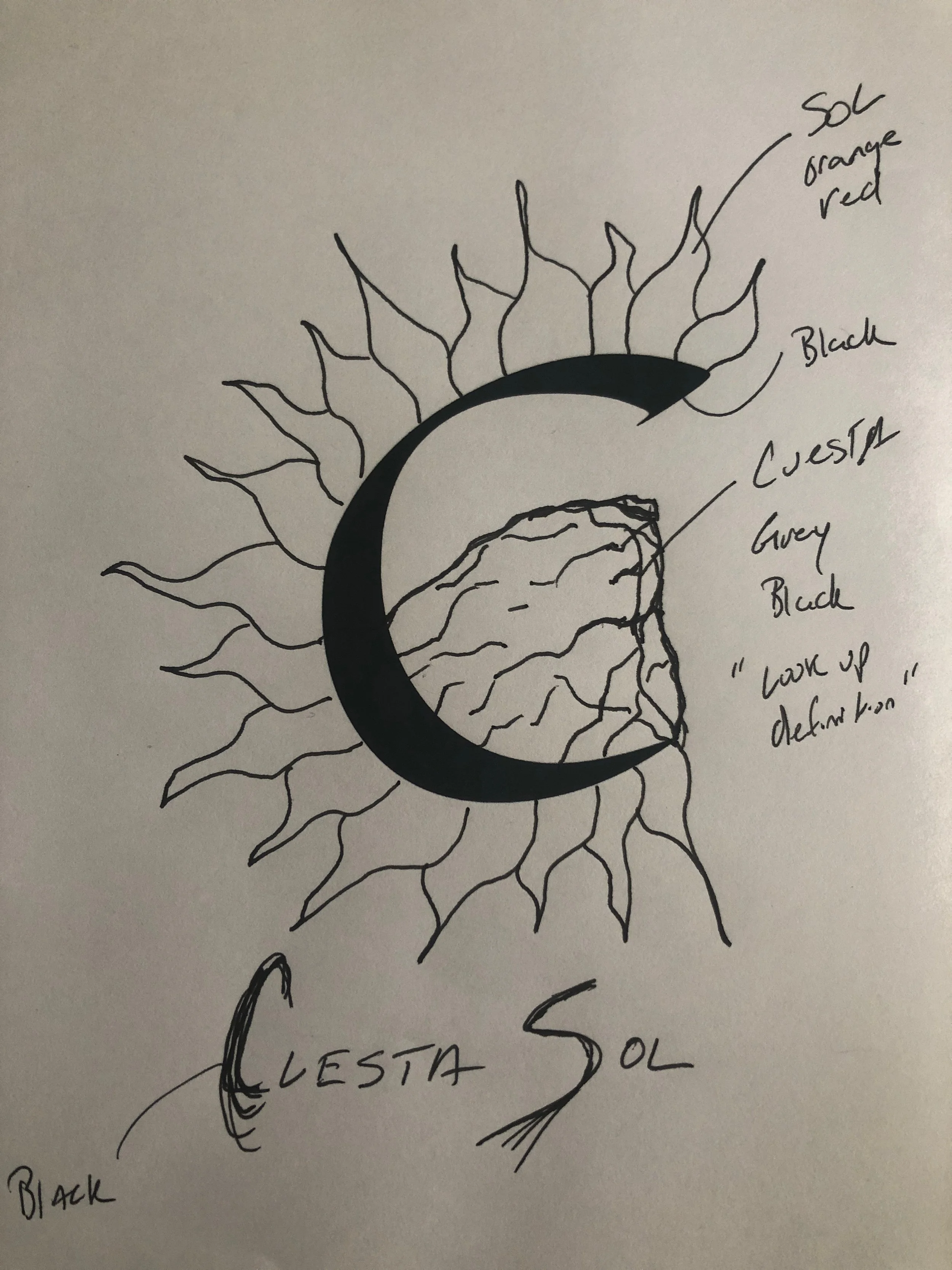
This is another real estate logo. Once I learned what a cuesta was, the logo pretty much made its self. I think I spent more time reading about geography than I did working on the artwork. It is super simple, but I am actually pretty proud of this one. It does a great job for its intended use. I love it when a plan comes together. It is a 1-hour slam-dunk!

Here is the sketch the client sent:

 
sketch.jpeg
 

Some work-in-progress:

And the final logo:

15: Pluto

I felt like I needed a win after those last two logos so I went a little deeper on this one. I have this little personal project that I swear I will finish before I die. I am drawing all of the planets in the solar system as a cyclops in a sort of cubist-inspired line-art style. I have notes and pencil sketches on all of them but only Mars/Ares and Neptune/Poseidon are finished to my satisfaction.

mars.jpg
neptune.jpg

I went into my notes and decided to finish Pluto/hades. I have been at this so long Pluto was still a planet when I started, and I feel bad the poor guy got demoted. 2.5 hours later…

pluto_reverse.png

I am happy with my angry little devil. In cyclops style, he has one eye, one horn, one nostril, and one tail. Floating out in space on his elliptical orbit.

14: Neugent Cycling

Time for another bike logo. I bought a set of wheels from this guy John Neugent a few years back. I recalled that he had a terrible logo, and I was pleased to see he hasn’t improved it. It makes my job easier. He is an interesting guy, and I still enjoy reading the email newsletters he sends out periodically. Here is the old logo:

This is going to be a quick cleanup job. Keep the ‘N’ in the circle. Switch to a geometric sans with roundish shapes. Go thin italic for lightweight speed. Green because I like it. Here it is:

This is a definite improvement, but looking at it now, it feels like a 1-hour failure. Why didn’t I harmonize the slant to the type and the mark? Why did I split the words with the mark when I knew it would look off-center? Why didn’t I do something about the near-collision of the ‘C’ and the ‘y’? I’m not going overtime on this one though. It is what it is. I am going to bed.

13: The Diagonalizer

While we are on the subject of cheating at the 1-hour-logo project, I will let you in on one of my cheap logo tricks. (I could write an article called “I made thousands of dollars with this one weird trick… You can too!”) Over the years, I have built up a library of rejected logo concepts. When I need to do a new logo, sometimes I dig through my library of rejects and recycle them. Sometimes a rejected idea can be a winner for a new client. I have in my library of rejects, a file called “diagonalizer.psd.” Sometimes I give my files stupid names. Don’t laugh; I know you do it too.

For today’s 1-hour logo I opened up the Diagonalizer and kicked out a few logos.

diagonalizer_01.jpg
diagonalizer_02.jpg
diagonalizer_03.jpg
diagonalizer_04.jpg

Someday I am going to sell the Diagonalizer to someone. If you think this logo design method is gross, blame Jason Pearson. He taught me this. He is the master.

12: RTNGF

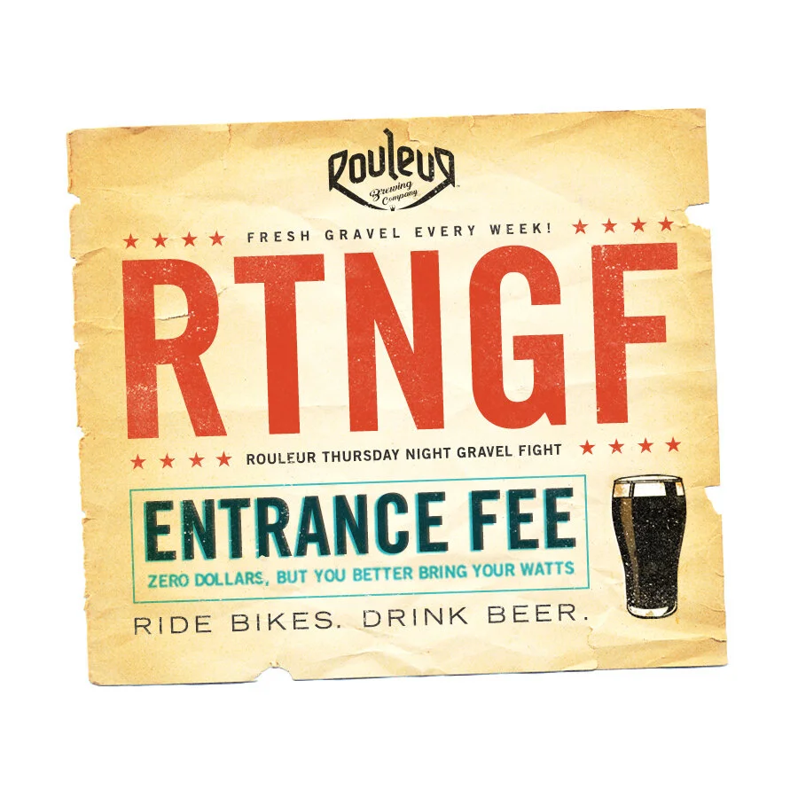
This one took 44 minutes, but I cheated pretty hard. I started with a party invitation I made over a decade ago. But is it really cheating? I mean, I’ve got years of experience doing this stuff AND years of files I have meticulously maintained that are at my fingertips on a moments notice. When I think… Hey what if I try something like that other thing I did, I can grab it and run super fast.

For the uninitiated, RTNGR is the ROULER THURSDAY NIGHT GRAVEL RIDE. I decided to turn it into a FIGHT and make an old-timey boxing poster. I meant to spend more time on the RTNGF and less time on the poster, but I got carried away. I used Trade Gothic because it is THE BEST. News Gothic can take a hike. Bebas is straight up garbage. Fight me!

rtngr.jpg

11: Greenwall Plumbing

I had 1-hour logo on my mind today when I was out getting some fresh air. (Ok Fine, you got me, I was riding my bike to Rouleur Brewing Company to get a crowler of Reapeur.) I saw a white van with black helvetica on it that said “Greenwall Plumbing” and I knew what today’s logo would be. This company had no design, so I tried to do the minimum to make an identity for this plumber. The obvious thing to do with the Greenwall logo is make it a green wall. So I did. I used Pluto to give it a little bit of a distinctive look without going overboard. From here I could go in a hundred different directions, but I am going to stay my hand. I should have kerned the W/A. Total time: 20 minutes.

gwp.png

It is not high art, but it is a perfectly serviceable logo, and honestly, I think it compares favorably against most other plumbing logos. Lets do some quick research… here are the logos from the plumbers closest to my house:

logo.png
VPI_Logo.png
ac_plumbing_logo_blue.png
anytyme-logo.png
logo-footer.jpg
ShortTransparent.png