I did this one in an absolute panic. When I sat down tonight I intended to do my own version of the Shimano 100th anniversary logo.
I wanted to wrap the logo in a shield, box, or other device, and add a circular spirally thing around the outside because to me, Shimano’s core competency is precision spinning metal. About 30 minutes in I could tell it wasn’t going in the right direction, and without enough time to right the ship, I pulled the plug. At 10:30pm I reset the clock and started over. I needed to post my logo before midnight (including writing this post) so I really needed to jam.
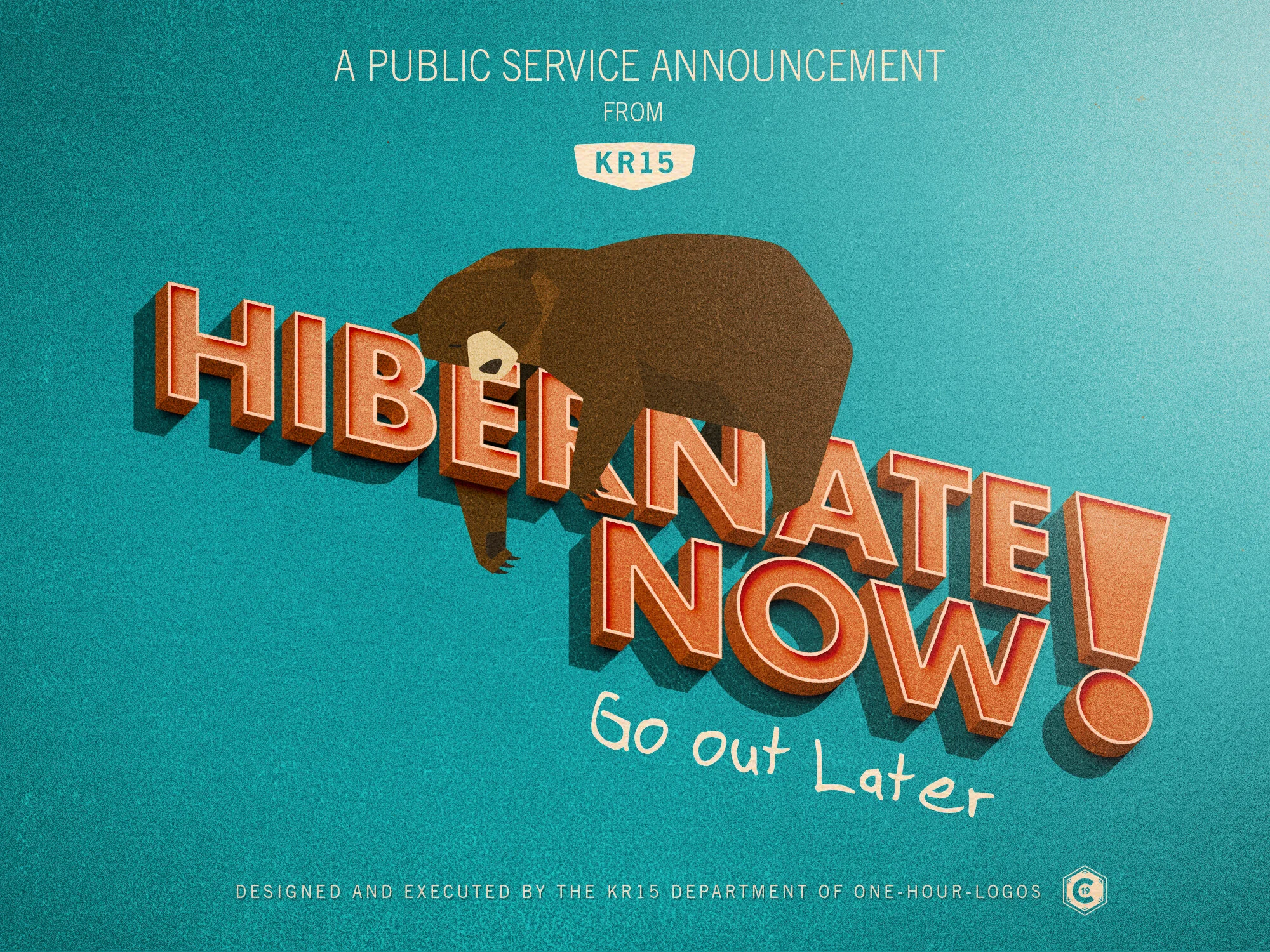
I had bears on my mind after a conversation earlier today with the Vegan Cyclist and his Ride Bikes Bro brand. I briefly toyed around with the idea of doing a RBB logo, but I am kind of bummed about all the knuckleheads still doing group rides during the early stages of a global pandemic, and I just read the news about beaches, trails, and parks shutting down with the very real possibility of a “DO NOT GO OUTSIDE AT ALL” order coming soon. “Ride bikes” doesn’t seem like the right message for the public today. Maybe Hibernate is better.

I used Futura Bold for the main text. It’s a timeless classic that you can always rely on. “Go out Later” is the KR15 font based on my handwriting. There are a bunch of alternate characters, but I was in such a rush I forgot to swap out one of the ‘o’s. I should have kerned the t-e. No time now. The bear was stock, No way I had all day to learn how to draw a sleepy bear. I did have to modify it to fit it on the letters though. In the last 10 minutes I decided to put a little WPA style text on it. I used Trade Gothic (the official font of KR15) ’cause it rules for this sort of thing. I snuck my 1-hour C19 logo in the corner. Total time 53 minutes. Whew!