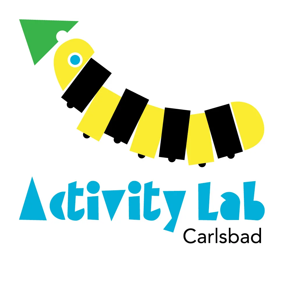
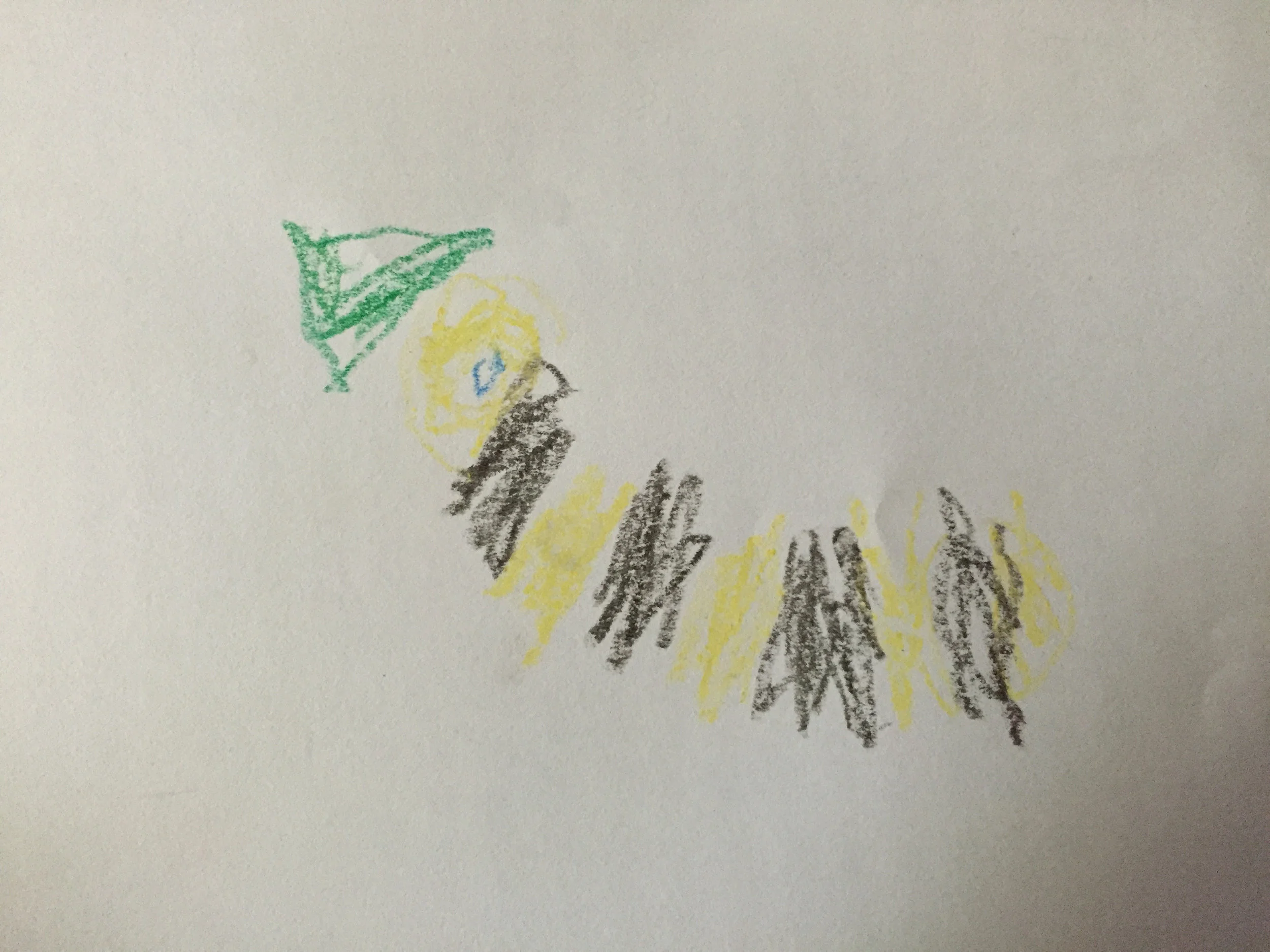
We have had a butterfly garden in our front yard for several years. It’s rad, and the kids love it. When my youngest son was 5, he drew this monarch caterpillar and wanted me to make it into a t-shirt for him. I never got around to making the shirt, but now his drawing has found a home as a logo for a kid’s science and exploration space where families and classes on field trips can go to learn.
09: Makarios Valley Ranch Deux
Back to the ranch today. I made a brand for Makarios Valley Ranch, and it had some pretty specific design parameters because of it’s application (being burnt into the flesh of a large hairy animal). I wanted to make a Logo for the ranch that related to the brand visually but wasn’t bound by the practical needs of a white-hot metal poker.
This one intimidated me because I wanted to try something I am not very good at. I had in mind something lyrical and feminine. Usually on a project like this I would art direct another artist, but for this project I am doing it myself. In only an hour. Lets go!
For my first attempt I started with the brand and fattened it up to give it some body and weight. This is my normal M.O. It’s fine. It’s good. I like it. But its so masculine, I wanted another try.

I went analog to explore a few different ideas in a short amount of time.
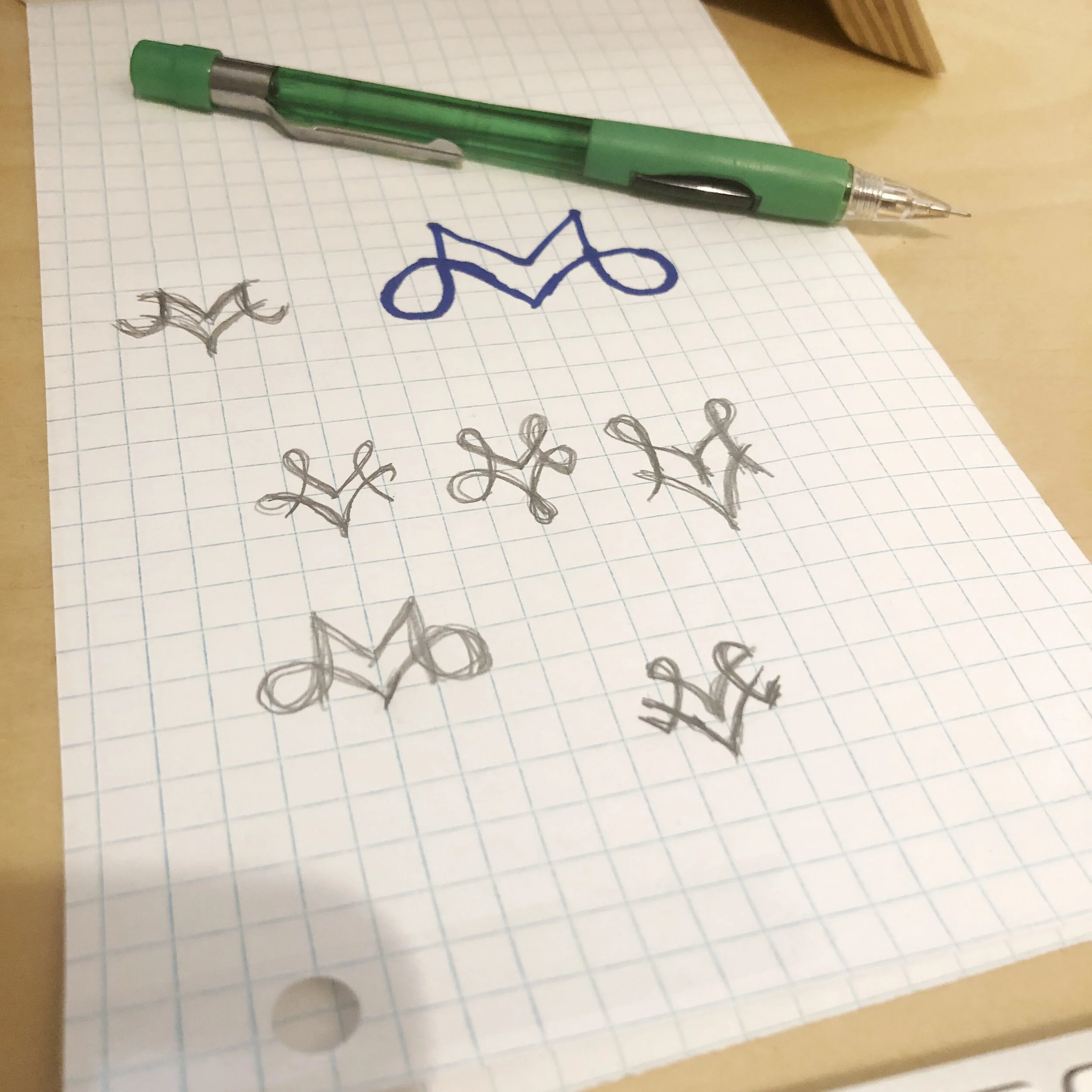
I felt like I had my feet under me so I went back to the computer and tried a few out. If I wanted to make something with organic curls and variable width strokes it was going to take too much time. It is not a skill that I have developed enough to just pull out a design in minutes. I stuck to fat mono-width strokes. Here is my AI file.

And my final design.

In the end I went over budget and spent 90-minutes on this one. I feel like this is a good start, and I am confident enough in where it is going that if I had 8 more hours I could come up with something beautiful and lyrical and amazing. But this is pretty legit for 90 minutes.
What do you think? Do you like the first one or the second better?
08: World Series of Beach Volleyball
Here is one from the archives. The World Series of Beach Volleyball was going through a rebranding process and one of the concepts that they requested was a play on the famous NBA logo. We all knew they would go in a different direction (and they did), but I got to spend an hour making it.

07: Covid-19
The health and well-being of our community is of vital concern to us, so the Makarios Valley Ranch logo has been cancelled due to concerns about the novel coronavirus Covid-19. The Makarios Valley Ranch logo will be rescheduled for a later date.
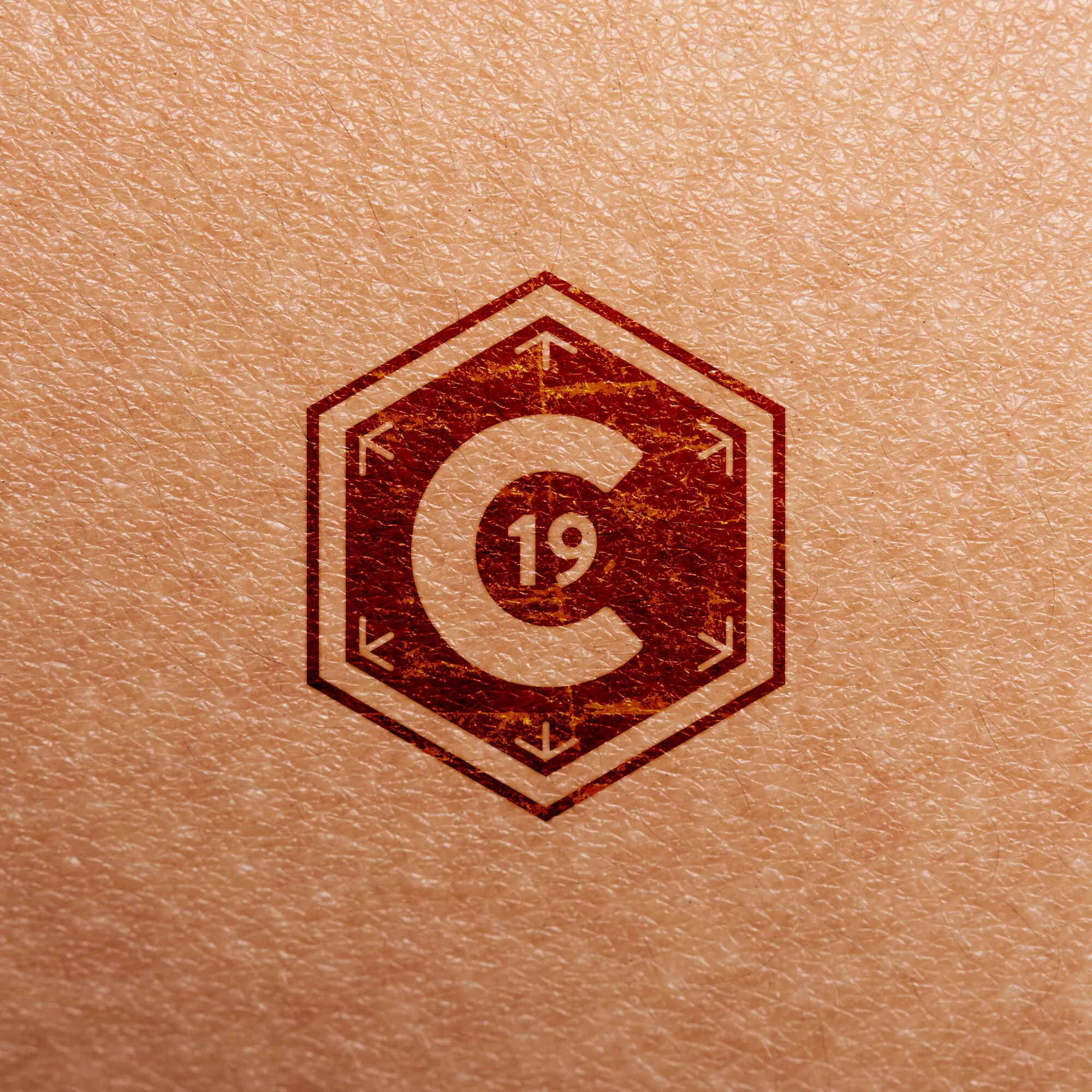
I designed this in my head on the way home from Costco. I wish this was a 4-hour-logo because I have more ideas (I even started a movie poster) but I need to go to bed now. This is the 1-hour version.
I used a hexagon because I thought of bacteriophages, and they have a hexagonal head. I had the thought that you could make a series of virus logos always inside of the same device that anybody could use as a shorthand. In news articles and broadcasts and whatnot.
This would be a good time to meditate on the nature of the 1-hour-logo project. This stuff is far from my best work. My best work always takes time, usually lots of time, or inspiration. But inspiration is for amateurs. It is not reliable. The point of this project is to find out what I can do under the gun, with no inspiration, leaning on the skills I have earned over years and years of doing the work. And to hopefully, tease out some of my bad habits so I can become a better artist. And its fun.
06: Makarios Valley Ranch
One of my oldest friends, Derek Bradley, said he was looking for a logo for his ranch. They are calling it Makarios Valley Ranch. μακάριος is Greek for “Blessed.” (Strong's Number: 3107 for you Bible nerds).
Before we get to the logo lets take a moment to appreciate this photo of Dereck from about 1990:

That’s me in the green shirt.
Dereck must have told me they also want to make a brand for their livestock. They only have sheep and pigs, and I don’t think you brand them. Maybe he was joking, but I got excited about making a brand. In my work I craft brands all the time, but I have never made a BRAND. This one would take a little research.
Apparently cattle branding is still a thing, and the California Department of Food and Agriculture has a brand registry and brand creation guidelines. Cheggitout. Cattle rustling is still a thing too. Here is a press release about the San Bernadino Sheriff using DNA evidence to bring down a cattle rustler. The world is a strange place. Anyway, the cattle ranching world has their own vernacular around brand styling. A sideways letter is called “Lazy.” If you add little lines to the side of a brand it is “Flying.” A line under the brand is a “Bar.” So a sideways ‘S’ with little wings and a line under it would be called “Flying Lazy S Bar.”
Adding three little lines above a brand makes it “Shining.” I liked the sound of that so I decided to make the “Shining M V” brand. The brand creation guidelines tell you to use a thin consistent line with large counters, and to leave gaps between lines that connect at sharp angles. Here it is:

And here it is photo-chopped onto some leather:

And here it is photo-chopped onto some cow:

That’s pretty good for a cow, but I still want to make a prettier version for non-livestock applications. So today I made the Makarios Valley Ranch BRAND, and tomorrow, I will make the Makarios Valley Ranch LOGO. I hope it doesn’t suck.
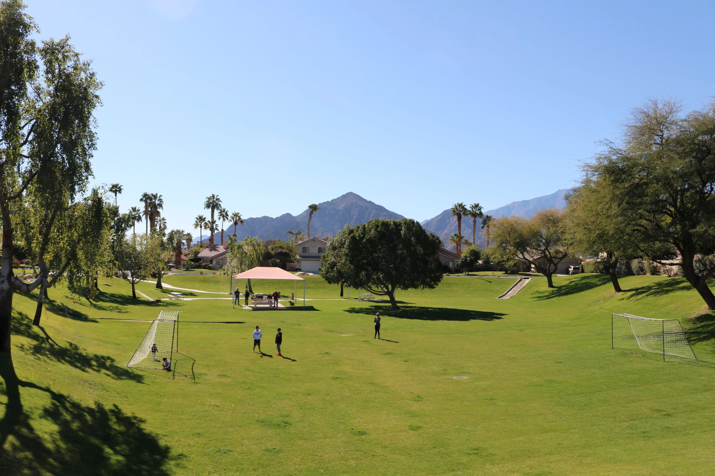
05: Parc La Quinta
A friend of mine had a project to create a logo for a track-home community in the Temecula area. He called me to get some concepts. I had NO TIME but I can’t resist a logo job. One-hour-logo to the rescue. Here is the brief:
The heart of the community is a park with a beloved landmark tree in the middle.
The mountains nearby are another signature element of the community and should be included in the logo.
The logo must include houses.
The client sent this photo of the tree and mountains:
With only an hour to work, I didn’t have time to argue about including houses. Here is my first comp:

I actually took the time to measure the angle of the mountain slopes in the photograph to make sure the logo resonated with the locals. As you can see, I was bummed out that Modula got rejected from the Monuments of Cycling logo, and I wanted to give it another chance. (This is how designers work.) I felt like I nailed a “clean & contemporary” look, but I hedged my bet and made a ”clean & classy” version with Hoefler Text and a gold color:

Feedback from the project manager:

04: Falcon Sales & Technology
Marc Chilcote suggested I re-do his employer’s 30-year-old logo. Seen Here.
I knew I should have passed as soon as I saw it was named “Falcon.” Birds are hard. They have been drawn a million times in a million different ways, and trying to do something new is tough. Also, I could spend all day drawing birds and wings before I came up with something I like, but I only have an hour for this.
I decided to zag instead of zig and use a talon. Maybe a talon holding the worlds. It didn’t work out. The clock was ticking so I decided to retreat to an area of strength and try a typographic solution. I went for Vonnes because it has ultra-wide and ultra-narrow widths and I knew I wanted to stack “Falcon” over “Sales & Services.” Mixing wide & narrow would help me out. I kerned FALCON tight, modified the F, L, and C, and stacked it.
At the last minute I punted and added a bird head. I guess it could work as type-only, but I was afraid it was too plain. Nothing says “Technology” like a circuit board background so I added one. I’m out of time and I feeling insecure about this one but I want people to like it, so I put in on an attractive girl’s t-shirt. Done.
I think I need to stay away from animals for the rest of this project. Animals need more time to do them right.

03: Monuments of Cycling
Monuments of Cycling is a company started by a crazy person named Michael Marckx to produce his cycling events, notably the Belgian Waffle Ride. I was creating a proposal deck for a new event and it occurred to me that MoC didn’t have a logo, so I set aside a little time to put together something appropriate.
I wanted something STRONG and MONUMENTAL so I started with a capital ‘M’ set in Gotham, placed in a block:

I was thinking of the cobblestone trophy awarded to the winner of the Paris Roubaix, and I tried turning it diagonally but it started to look like the Enron logo.
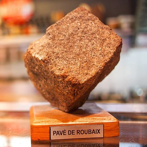
I pivoted the award/trophy concept to a badge and brought the bottom of the block to a point:

I should note, at this point, that to keep a connection to MoC’s signature event, I restricted myself to the Belgian Waffle Ride color palette:

I knew I wanted a narrow typeface to go with the logo, and I tried to bring in some 1990’s flair with Emigré Modula:

The client didn’t like it. He had me switch to FB Agency. Agency isn’t as idiosyncratic as Modula, but it is also from the mid-1990’s so I feel like we both got what we wanted. I added a crown to make sure the concept of the logo as an award wasn’t lost:

The logo can be used in a horizontal lock-up as shown above, but my preferred configuration has the type integrated with the mark:

This logo took a little under an hour of design time, but it was spread out over 2 days and if you add time spent generating JPGs and PNG files for the client, it was closer to 90 minutes. I love this logo. It was a home-run.
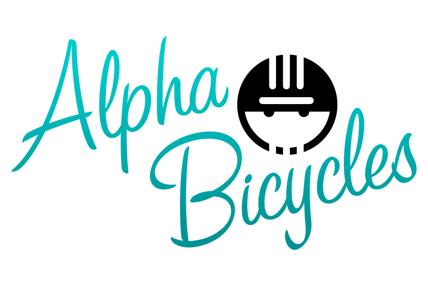
02: Alpha Bicycles
This one is more of a 30-minute logo.
I love bicycles, so today’s logo is bicycle themed. There used to be a little bike shop in Vista named Alpha Bicycles. It was owned by a man named Chris, who closed it when he retired. It was a cool little shop that reminded me of the bike shops I would go into as a kid, with old parts hanging all over the walls and a generous selection of used bikes. Chris was great. He would sometimes not charge you full price if he liked you and you were buying some obscure part to fix up an old bike. He also once donated some parts to help a friend of mine fix up a bike for a homeless man.
His logo was terrible though.
I tried to make something that would convey the friendly disarming nature of his shop, and would look good on a t-shirt. I was happy to have the chance to use a script typeface. In this age of geometric sans-serifs, I seldom get to with my paying clients. Here it is:
Here is his actual logo:
01: Jetpack!
Here is an un-solicited logo for a company my brother worked for. I know that in the past they toyed around with the tagline “your best friend in marketing” and I always wanted their logo to be a dog with a jetpack. Getting rid of "in marketing" lets the logo work for a broad range business services companies. Maybe this could be a logo for a software developer or a financial consultant.
I also designed Jetpack’s REAL logo seen here:
