Monuments of Cycling is a company started by a crazy person named Michael Marckx to produce his cycling events, notably the Belgian Waffle Ride. I was creating a proposal deck for a new event and it occurred to me that MoC didn’t have a logo, so I set aside a little time to put together something appropriate.
I wanted something STRONG and MONUMENTAL so I started with a capital ‘M’ set in Gotham, placed in a block:

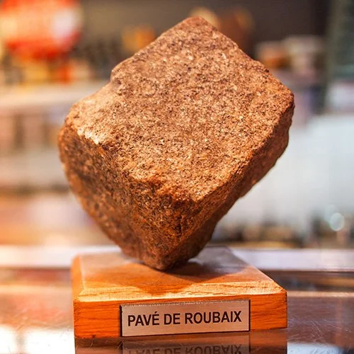
I was thinking of the cobblestone trophy awarded to the winner of the Paris Roubaix, and I tried turning it diagonally but it started to look like the Enron logo.
I pivoted the award/trophy concept to a badge and brought the bottom of the block to a point:

I should note, at this point, that to keep a connection to MoC’s signature event, I restricted myself to the Belgian Waffle Ride color palette:

I knew I wanted a narrow typeface to go with the logo, and I tried to bring in some 1990’s flair with Emigré Modula:

The client didn’t like it. He had me switch to FB Agency. Agency isn’t as idiosyncratic as Modula, but it is also from the mid-1990’s so I feel like we both got what we wanted. I added a crown to make sure the concept of the logo as an award wasn’t lost:

The logo can be used in a horizontal lock-up as shown above, but my preferred configuration has the type integrated with the mark:

This logo took a little under an hour of design time, but it was spread out over 2 days and if you add time spent generating JPGs and PNG files for the client, it was closer to 90 minutes. I love this logo. It was a home-run.