
A friend of mine had a project to create a logo for a track-home community in the Temecula area. He called me to get some concepts. I had NO TIME but I can’t resist a logo job. One-hour-logo to the rescue. Here is the brief:
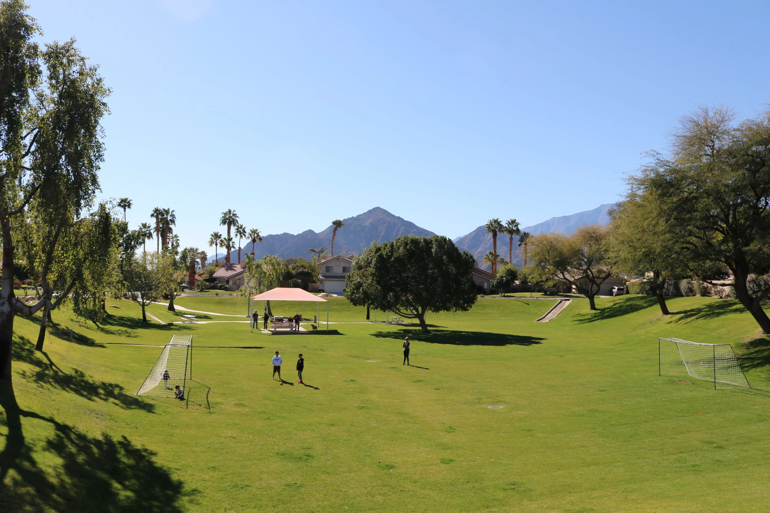
The heart of the community is a park with a beloved landmark tree in the middle.
The mountains nearby are another signature element of the community and should be included in the logo.
The logo must include houses.
The client sent this photo of the tree and mountains:
With only an hour to work, I didn’t have time to argue about including houses. Here is my first comp:

I actually took the time to measure the angle of the mountain slopes in the photograph to make sure the logo resonated with the locals. As you can see, I was bummed out that Modula got rejected from the Monuments of Cycling logo, and I wanted to give it another chance. (This is how designers work.) I felt like I nailed a “clean & contemporary” look, but I hedged my bet and made a ”clean & classy” version with Hoefler Text and a gold color:

Feedback from the project manager:
