Back to the ranch today. I made a brand for Makarios Valley Ranch, and it had some pretty specific design parameters because of it’s application (being burnt into the flesh of a large hairy animal). I wanted to make a Logo for the ranch that related to the brand visually but wasn’t bound by the practical needs of a white-hot metal poker.
This one intimidated me because I wanted to try something I am not very good at. I had in mind something lyrical and feminine. Usually on a project like this I would art direct another artist, but for this project I am doing it myself. In only an hour. Lets go!
For my first attempt I started with the brand and fattened it up to give it some body and weight. This is my normal M.O. It’s fine. It’s good. I like it. But its so masculine, I wanted another try.

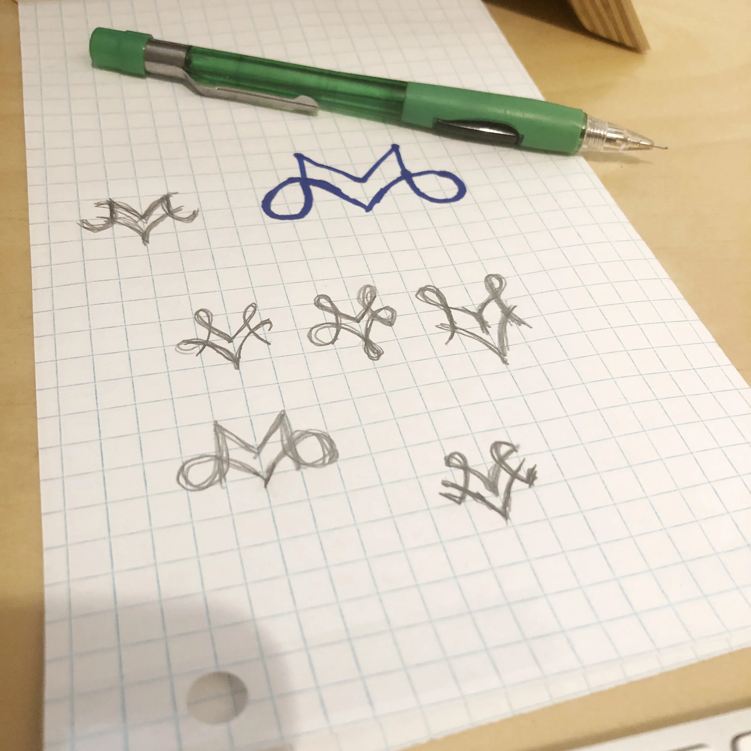
I went analog to explore a few different ideas in a short amount of time.
I felt like I had my feet under me so I went back to the computer and tried a few out. If I wanted to make something with organic curls and variable width strokes it was going to take too much time. It is not a skill that I have developed enough to just pull out a design in minutes. I stuck to fat mono-width strokes. Here is my AI file.

And my final design.

In the end I went over budget and spent 90-minutes on this one. I feel like this is a good start, and I am confident enough in where it is going that if I had 8 more hours I could come up with something beautiful and lyrical and amazing. But this is pretty legit for 90 minutes.
What do you think? Do you like the first one or the second better?