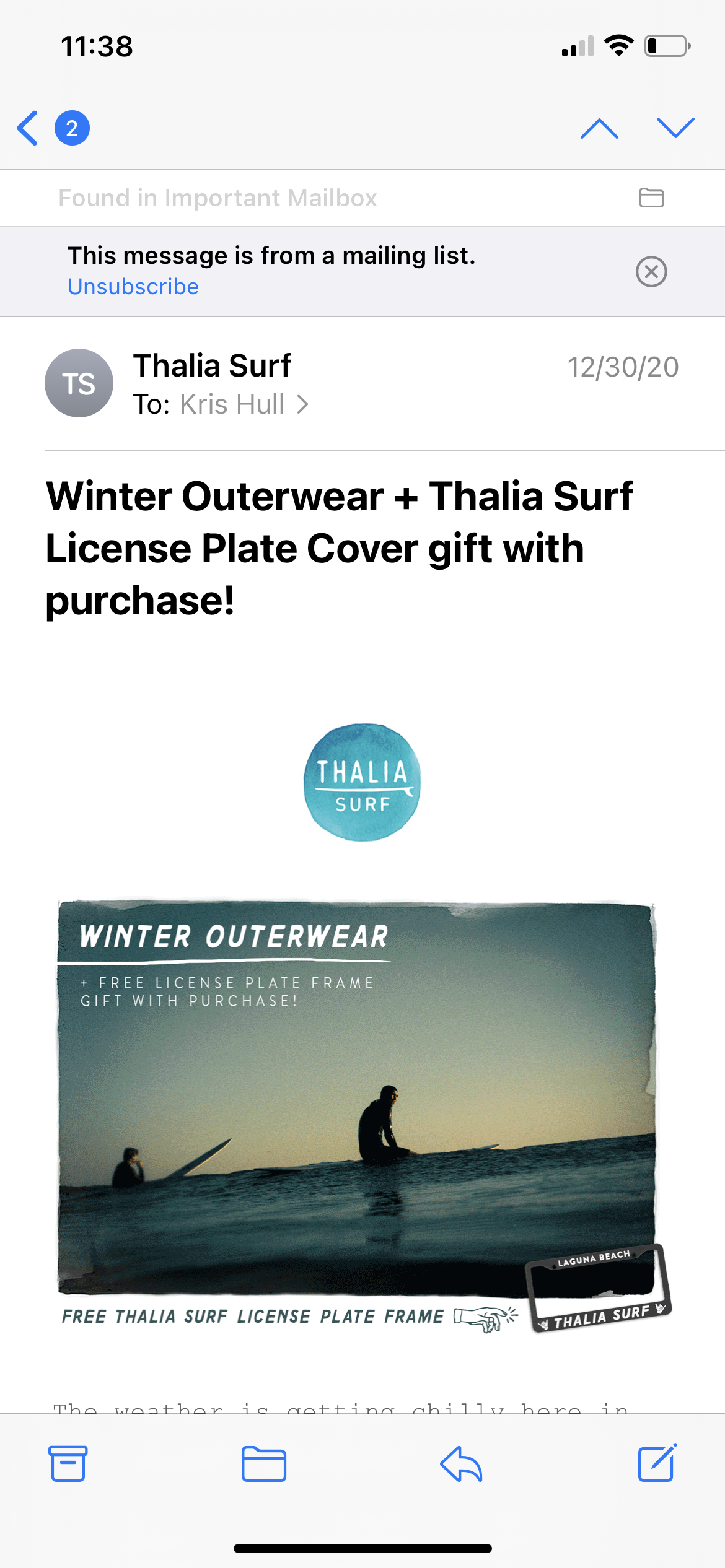
Older designers have been taught that if they want to give their work visual punch they should use a 16x9 landscape aspect ratio. This is cinematic! And it closely matches the aspect ratio of a laptop screen, meeting room display, or desktop monitor.
But this is wrong.
Emails clients are currently hovering at about 60% mobile. Desktop email clients either constrain the email to a narrow width, or split the UI into columns, or both.
To illustrate this, let’s take a look at three emails from three clothing sellers in the active lifestyle market.
EMAIL #1: ELIEL
Here is the email as viewed by Gmail in Safari.

Just in case that isn’t working for you, here is a screencast of the email:
Here are the opening screens on an iPhone 12


